Introduction to Color Psychology in Home Design
Color is more than just a decorative element—it’s a powerful tool that shapes our emotions, behaviors, and overall well-being. In American home design, color psychology has become increasingly important as people seek to create living spaces that not only look beautiful but also promote healing, comfort, and positivity. Understanding how colors influence our mood and health can help homeowners make thoughtful choices that reflect their personal style while supporting mental and emotional balance. Whether you’re renovating your entire house or simply updating a room, learning the fundamentals of color psychology provides an essential foundation for creating uplifting and restorative environments tailored to the needs of modern American families.
2. How Colors Influence Mood and Behavior
Color psychology plays a pivotal role in shaping our emotions, behaviors, and even energy levels within the home environment. The colors you choose for your living spaces are more than just a matter of taste—they can actively support mental wellness, relaxation, focus, and healing. By understanding how different hues impact us, you can intentionally design rooms that uplift, energize, or soothe according to your lifestyle needs.
The Science Behind Color Perception
When light enters our eyes, it triggers psychological and physiological responses that influence our mood and behavior. For example, warm tones like reds and oranges stimulate the senses and raise energy levels, while cool shades such as blues and greens are known to calm the mind and promote tranquility. This science is why hospitals often use soft greens in patient rooms or why energetic workout spaces lean toward vibrant yellows or reds.
Common Color Effects in Home Design
| Color | Emotional Impact | Best Room Applications |
|---|---|---|
| Blue | Calming, lowers stress | Bedrooms, bathrooms |
| Green | Restorative, balances energy | Living rooms, offices |
| Yellow | Energizing, boosts mood | Kitchens, entryways |
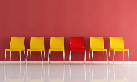
| Red | Stimulating, increases passion | Dining rooms, exercise areas |
| Purple | Sophisticated, inspires creativity | Home libraries, studios |
| Neutrals (white, gray) | Cleansing, versatile foundation | Any room for balance or accentuation |
Cultural Contexts in American Homes
In the United States, color preferences are often shaped by regional traditions and lifestyle trends. For example, coastal homes may favor breezy blues and whites reminiscent of the ocean, while Southwestern interiors celebrate earthy terracotta and sage green. No matter where you live, aligning your color palette with both your personal healing needs and cultural context can make your home feel uniquely comforting and supportive.
![]()
3. Trendy and Healing Color Palettes for the American Home
In the U.S., color trends in home design reflect a blend of personal expression, wellness priorities, and cultural influences. Homeowners are increasingly seeking palettes that dont just look modern but also contribute to emotional well-being and a sense of comfort. Here are some of the most popular and healing color palettes currently embraced across American homes—and tips on choosing hues that uplift and heal.
Earthy Neutrals: Embracing Calm and Stability
Shades like warm taupe, soft beige, clay, and creamy whites remain favorites for their grounding qualities. These colors create a serene backdrop that fosters relaxation—ideal for living rooms or bedrooms where unwinding is key. Earthy tones also pair well with natural materials like wood or stone, amplifying feelings of stability and connection to nature.
Fresh Greens: Invigorating and Rejuvenating Spaces
Sage, olive, and eucalyptus greens have surged in popularity as Americans turn to biophilic design principles. These gentle greens evoke growth, renewal, and harmony—perfect for kitchens or bathrooms where you want to feel refreshed each day. Green’s association with health makes it a prime choice for creating restorative environments.
Soothing Blues: Promoting Peace and Clarity
From tranquil sky blues to deep navy accents, blue tones are linked to calmness and mental clarity. Many homeowners use blue in bedrooms or home offices to reduce stress and encourage focus. Pairing blue with crisp whites or soft greys can amplify its soothing effects while keeping spaces feeling airy and open.
Sunny Yellows: Bringing Cheerful Energy Indoors
Pale butter yellows or muted golds are trending as accent colors that foster joy and optimism. Used thoughtfully—in entryways, breakfast nooks, or creative corners—yellow can lift spirits without overwhelming the senses. It’s all about balance: too much yellow can be overstimulating, but subtle pops bring warmth and positivity.
Tips for Selecting Your Palette
When choosing a healing color scheme for your home, consider both current trends and your personal needs. Think about how different shades make you feel throughout the day, and don’t be afraid to experiment with combinations that reflect your unique style. Remember—color isn’t just decoration; it’s nourishment for your mood and well-being.
4. Room-by-Room Color Strategies
Designing a harmonious home starts with choosing colors that serve both your emotional well-being and your lifestyle. Each room in your house plays a unique role, so selecting the right palette can enhance mood, foster connection, or promote relaxation. Here are tailored color recommendations for living rooms, bedrooms, kitchens, and bathrooms based on color psychology and everyday needs.
Living Room: Fostering Connection & Comfort
The living room is often the heart of the home—a space for entertaining, relaxing, and bonding. Warm neutrals like taupe, beige, and soft gray create a welcoming environment that encourages conversation and togetherness. If you want to energize the space, try accents of mustard yellow or muted coral. These hues are shown to boost optimism and sociability without overwhelming the senses.
Bedroom: Promoting Rest & Tranquility
Bedrooms should be a sanctuary for rest. Soft blues, gentle greens, and lavender tones are known for their calming effects on the mind and body. These shades help lower stress levels and support healthy sleep cycles. Avoid overly bright or stimulating colors—like bold reds or vibrant oranges—which may interfere with relaxation.
Kitchen: Encouraging Vitality & Appetite
Kitchens thrive on energy and warmth. Sunny yellows stimulate appetite and bring cheerfulness to morning routines. Earthy greens evoke freshness—think sage or olive—and inspire healthier food choices. For a modern twist, deep navy paired with white cabinets creates a crisp, clean look that appeals to American design sensibilities.
Bathroom: Supporting Cleanliness & Calm
Bathrooms benefit from colors that evoke cleanliness and serenity. Pale blues and seafoam greens are classic choices—they visually expand small spaces while promoting calmness. Soft whites or light grays can create a spa-like atmosphere without feeling cold or clinical.
Quick Reference: Color Strategies by Room
| Room | Recommended Colors | Psychological Effect | Lifestyle Benefit |
|---|---|---|---|
| Living Room | Taupe, Beige, Soft Gray, Mustard Yellow Accents | Warmth, Sociability | Encourages connection; comfortable gatherings |
| Bedroom | Soft Blue, Gentle Green, Lavender | Calming, Stress-Relieving | Improved sleep; restful retreat |
| Kitchen | Sunny Yellow, Sage Green, Deep Navy & White | Energizing, Appetite-Stimulating | Lively meals; promotes healthy choices |
| Bathroom | Pale Blue, Seafoam Green, Soft White | Cleansing, Relaxing | Spa-like calm; fresh start to the day |
By aligning color choices with psychological research and practical needs in each space, you create a home that not only looks beautiful but also supports your daily life and well-being.
5. Incorporating Personal Style with Functional Color Choices
When it comes to designing a home that feels both inviting and restorative, blending your personal style with functional, psychology-backed color choices is key. While science tells us that blues calm, greens restore, and yellows energize, your home should ultimately reflect who you are and what makes you feel good. To strike the right balance, start by identifying colors you’re naturally drawn to—perhaps the soft sage of your favorite sweater or the deep navy from a beloved piece of art. Then, review how these shades align with psychological research about mood and wellness. For example, if you love vibrant reds but want a restful bedroom, consider using red as an accent (like throw pillows or artwork) rather than wall paint.
Combining Evidence and Expression
A practical approach is to choose a neutral base inspired by wellness research—such as warm whites or gentle grays—and layer in pops of your signature colors through furniture, rugs, or décor. This method allows you to enjoy the uplifting effects of color without overwhelming a space. In communal areas like kitchens or living rooms, research suggests incorporating cheerful hues like soft yellows or light corals can boost sociability and positivity while still providing flexibility for personal touches.
Room-by-Room Customization
Consider tailoring your color choices to each room’s purpose. Calm tones like pale blue in bedrooms support relaxation, while invigorating accents such as orange in a workout nook can motivate activity. Don’t be afraid to blend styles—eclectic combinations can still promote well-being when chosen thoughtfully. Use texture and pattern to add depth without sacrificing harmony.
Trust Your Intuition
Finally, remember that your emotional response matters just as much as scientific findings. If a certain shade fills you with joy—even if it’s unconventional—find creative ways to weave it into your design scheme. By combining evidence-based recommendations with personal flair, you’ll create a home environment that not only looks beautiful but also supports your well-being on every level.
6. Tips for a Healthier, Happier Home through Color
Start with Your Mood Goals
Begin by asking yourself how you want each room to feel. For example, if you crave calm and relaxation in your bedroom, opt for cool blues or soft greens—both colors proven in research to lower stress levels and support restful sleep. In communal spaces like the living room or kitchen, warm tones such as gentle yellows, terracotta, or earthy oranges can foster connection and boost energy. Think about what emotional experience you want to cultivate and let that guide your color palette choices.
Layer Neutrals with Pops of Color
American home design trends often favor clean, neutral backdrops that provide flexibility and longevity. To keep things lively and nourishing, layer in accent pieces—like throw pillows, art, or rugs—in vibrant hues that align with your wellness goals. For instance, add a cheerful pop of yellow in the kitchen to stimulate appetite and positivity, or bring in leafy green accessories in the dining area to inspire freshness and vitality.
Prioritize Natural Light and Paint Finishes
The way color appears is heavily influenced by light. In U.S. homes, large windows are often valued for maximizing daylight. Choose lighter shades near windows to amplify sunlight and create an uplifting atmosphere. Use matte finishes for bedrooms to reduce glare and promote tranquility, while glossier finishes in bathrooms or kitchens can make spaces feel cleaner and more invigorating.
Use Biophilic Colors for Wellness
Biophilic design—a trend rooted in connecting humans with nature—is gaining popularity across America. Incorporate forest greens, sky blues, or sandy beiges to mimic outdoor environments known to enhance well-being. These shades not only evoke serenity but also help bridge the gap between indoor comfort and natural nourishment.
Create Zones with Color
If your home features open-plan layouts common in American architecture, use color strategically to define different zones. A soothing pale blue nook can become a meditation corner; an energizing coral wall may designate a creative workspace. This approach supports mental clarity while ensuring each area serves its healthiest function.
Honor Cultural Heritage through Color Choices
Finally, embrace colors that resonate with your cultural background or family traditions—whether it’s Navajo-inspired earth tones, Scandinavian whites, or bold Caribbean hues. Surrounding yourself with meaningful colors creates a deeper sense of belonging and emotional nourishment at home.
By weaving these tips into your home design strategy, you can harness the power of color psychology not just for aesthetics, but as a tool for daily healing and happiness tailored to your unique lifestyle.